Buy/Sell Volume BarsCalculates buy and sell volume on each candle. Recommended only for visual use - sell volume is same as "total volume" so it will not get covered by buyvolume.
"Buy sell" için komut dosyalarını ara

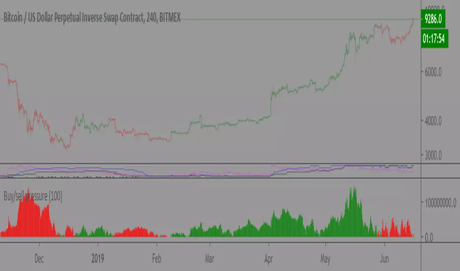
Buy/sell pressure (volume)Still early phase.
Looks at volume pressure over the course of a bar and compares to the last x bars to see if sell or buy pressure is greater. Visualized as an indicator and barcolor.
Recommended length: 100
Buy/sell signals & Top/Bottom (DEMO) • IntradayAnyone can trade with the Intraday indicator. Perfect for Day trading, Swing trading and scalping
How does the script work ?
The LONG and SHORT signals are clearly identifiable with colored candlesticks.
Find the potential Top and bottom on any interval.
Add alerts (PRO feature)
All time interval (Pro feature)
The intraday script is working on any assets (Forex, Crypto, Indices, Stocks…)
DEMO only: 1h CHART /
The indicator is available via subscription and you can enjoy a 7-day free trial . To know more about the indicator and start the trial simply visit the link below.

Buy/Sell Points by CoinsolosWTCROSS indikatörü temel alınarak oluşturulmuştur. Aynı zamanda iyi sinyal vermek için RSI değerlerini de takip eder ve WTCROSS indikatörü kadar çok sinyal üretmez.
İlgilendiğiniz coin ve periyot için indikatörün eski verdiği sinyalleri inceleyin ve alış/satış sinyallerine alarm kurun. Alarm kurarken "Mum kapanışında bir defa (Once Per Bar Close)" ayarını kullanın.
Alış sinyali geldiğinde doğrudan market fiyatından almak yerine o anki fiyatın biraz altına Limit Order girin ve bekleyin. Ani hareketlerde kayıp yaşamamak için mutlaka stop-loss kullanın.
Bazen sat sinyali verdikten sonra fiyat tekrar yukarı hareket edebilir ancak satmak için bunu beklemek yerine doğrudan satış yapmanızı tavsiye ederim. Eğer fiyat hızlı şekilde düşerse satmak için fırsatınız olmayabilir.
4 saatten aşağı periyotlarda kullanılmasını önermiyorum.
İndikatör ayarlarını kullanılarak daha sağlıklı sonuç alacak şekilde denemeler yapabilir ve başarılı bulduğunuz ayarları yorum olarak paylaşabilirsiniz.
It is based on wtcross indicator. Also follows RSI value to give good signals. It doesn't produce signals as much as wtcross indicator does.
Do your back test for the coin and the period you interested and set alarm for buy and sell signals with "Once Per Bar Close" setting.
Don't buy market price on buy signal. Just put your buy limit order a bit below of the market price and wait. Always use stop-loss to protect your buy funds.
Sometimes prices goes up after sell signal but to be sure sell on sell signal because it can go down rapidly.
It is not suggested to use period less than 4 hour.
By using indicator settings you can try different variations and make a comment your successfull settings.

Buy/Sell Points by CoinsolosWTCROSS indikatörü temel alınarak oluşturulmuştur. Aynı zamanda iyi sinyal vermek için RSI değerlerini de takip eder ve WTCROSS indikatörü kadar çok sinyal üretmez.
İlgilendiğiniz coin ve periyot için indikatörün eski verdiği sinyalleri inceleyin ve alış/satış sinyallerine alarm kurun. Alarm kurarken "Mum kapanışında bir defa (Once Per Bar Close)" ayarını kullanın.
Alış sinyali geldiğinde doğrudan market fiyatından almak yerine en son yeşil mumun açılış (OPEN) fiyatına Limit Order girin ve bekleyin. Ani hareketlerde kayıp yaşamamak için mutlaka stop-loss kullanın.
Bazen sat sinyali verdikten sonra fiyat tekrar yukarı hareket edebilir ancak satmak için bunu beklemek yerine doğrudan satış yapmanızı tavsiye ederim. Eğer fiyat hızlı şekilde düşerse satmak için fırsatınız olmayabilir.
4 saatten aşağı periyotlarda kullanılmasını önermiyorum.
It is based on wtcross indicator. Also follows RSI value to give good signals. It doesn't produce signals as much as wtcross indicator does.
Do your back test for the coin and the period you interested and set alarm for buy and sell signals with "Once Per Bar Close" setting.
Don't buy market price on buy signal. Put your buy order on the open price of the latest green candle and wait. Always use stop-loss to protect your buy funds.
Sometimes prices goes up after sell signal but to be sure sell on sell signal because it can go down rapidly.
It is not suggested to use period less than 4 hour.

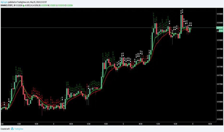
Buy-Sell BuddyS = Confirmed sell signal
B = Confirmed buy signal
U = Unknown signal - hold previous position
This is a simple script based on MACD and exponential moving average working together. If there is a disagreement between them, an "unknown" state is shown and denoted by a "U".
Buy - Sell Signal_botCrypto_bot signals, buy or sell signals form daily charts, 1hr and 4hr charts, Please create alerts accordingly, only trigger once per bar close.


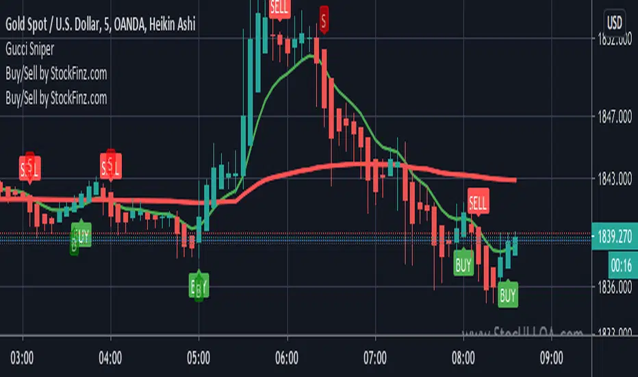
Buy Sell Signal — Ema crossover [© gyanapravah_odisha]Professional EMA Crossover + ATR Risk Control
Trade with confidence using a complete system that gives you clear entries, smart exits, and full automation.
Includes:
Precision 5/13 EMA crossover signals
ATR-based adaptive stop-loss
Multiple take-profit levels (with intermediate targets)
Fully customizable R:R ratios
ATR + volume filters to avoid choppy markets
Real-time trade dashboard
All alerts included
Built for: Crypto, Forex, Stocks • Scalping & Swing Trading
Built for you: Free, open-source & made for real-world trading.

Hishyar 1Buy/Sell Kesek o Sor
Indicator for short, intermediate, and long term trend analysis with entry and exit indicator.
Works on all INDICIES, FOREX, CRYPTO, STOCKS, BONDS etc.

Buy, Sell and Trend Signal by ToluThis indicator is a simple guidance for the trend. Best works in index charts to show general market trend. Use it in daily graphs. In lower periods there may be more fake signals due to daily noise. Also intraday signals may be fake so better use , is more meaningful when close to trading session. I do not accept any responsiblity from the use of this indicator.
Risk Disclaimer
It is important to understand that this indicator is purely for educational purposes, and the information presented must be considered only general in nature.
The information or the signals provided does not take your specific needs or circumstances into consideration, and you must look at your own personal situation and requirements before making any financial decisions, and seek independent financial advice if necessary.

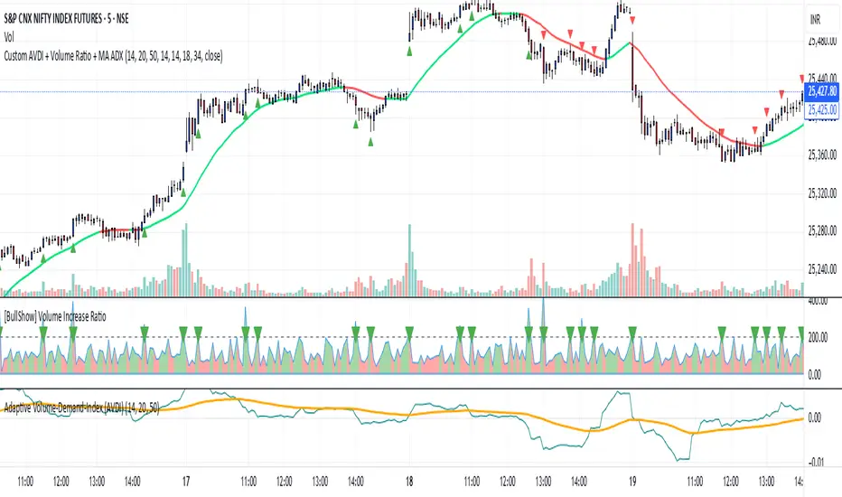
Custom indictrbuy sell idicator inal output is the EMA Index, which is a smoothed exponential moving average of the Raw Demand Index. This EMA acts as the primary signal line, providing a clearer, less noisy reading that is easier to interpret.
Buy/Sell Indicator with Resistance/Support LevelsThis is a simple Multi-Indicator Analysis
Customizable moving averages (SMA, EMA, WMA)
RSI with overbought/oversold levels
MACD with signal line crossovers
Automatic support and resistance level detection
Smart Signal Generation
Strong signals: Require multiple indicators to align
Weak signals: Single indicator confirmations
Visual markers for different signal strengths
Advanced Features
Real-time info table showing current values
Automatic support/resistance line drawing
Multiple alert conditions
Clean, customizable display options


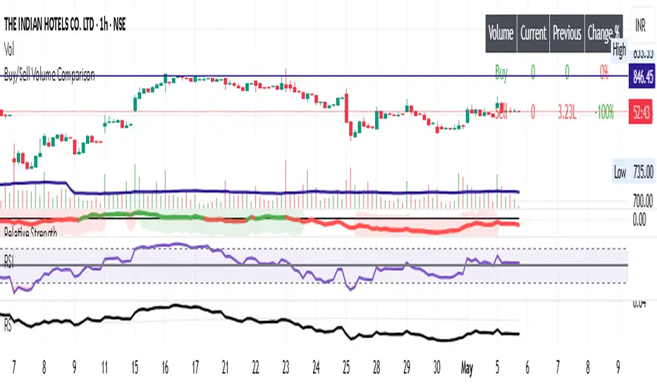
Buy/Sell Volume ComparisonKey improvements:
Direct volume comparison: Now shows the current day's volume and previous day's volume side by side
Percentage change display: Clear percentage change with up/down arrows
Table position customization: Added a dropdown menu to select where you want the table to appear
To adjust the table position:
Click on the settings (gear icon) for the indicator after adding it to your chart
You'll see a dropdown menu labeled "Table Position"
Select from options like "Top Right", "Bottom Left", etc.
Click "OK" to apply your changes
This version also handles the case where there's no previous volume data (first bar of the chart) by checking for NA values.
Let me know if this meets your requirements, or if you'd like any other adjustments!RetryClaude does not have the ability to run the code it generates yet.Claude can make mistakes. Please double-check responses.Tip: Long chats cause you to reach your usage limits faster.
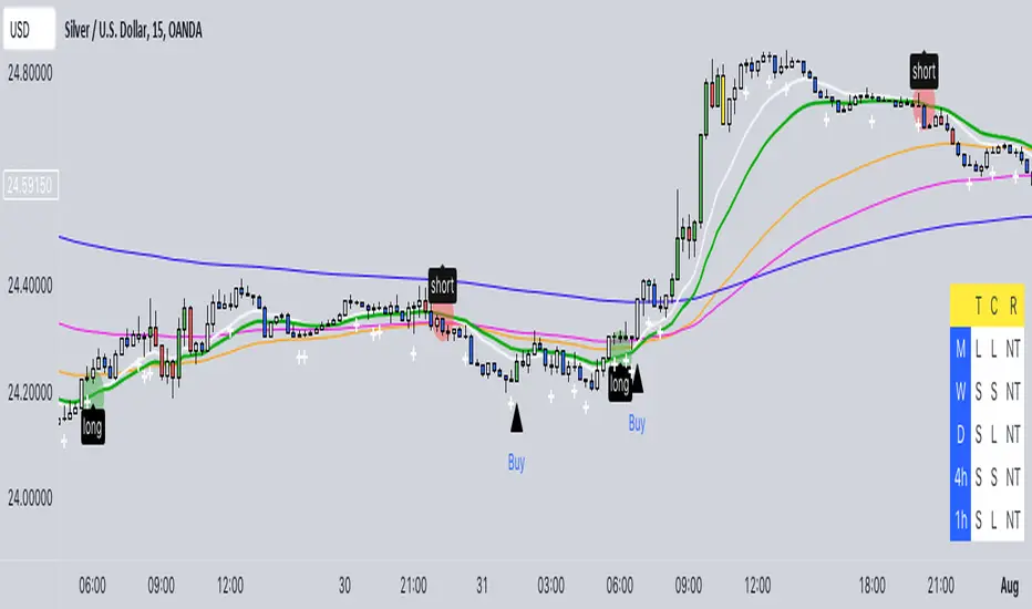
Buy/Sell EMA CandleThis indicator is designed to display various technical indicators, candle patterns, and trend directions on a price chart. Let's break down the code and explain its different sections:
Exponential Moving Averages (EMA):
The code calculates and plots five EMAs of different lengths (13, 21, 55, 90, and 200) on the price chart. These EMAs are used to identify trends and potential crossovers.
Engulfing Candle Patterns:
The code identifies and highlights potential bullish and bearish engulfing candle patterns. It checks if the current candle's body size is larger than the combined body sizes of the previous and subsequent four candles. If this condition is met, it marks the pattern on the chart.
s3.tradingview.com
EMA Crossovers:
The code identifies and highlights points where the shorter EMA (ema1) crosses above or below the longer EMA (ema2). It plots circles to indicate these crossover points.
Candle Direction and RSI Trend:
The code determines the trend direction of the last candle based on whether it closed higher or lower than its open price. It also calculates the RSI (Relative Strength Index) and determines its trend direction (overbought, oversold, or neutral) based on predefined thresholds.
s3.tradingview.com
Table Display:
The code creates a table displaying trend directions for different timeframes (monthly, weekly, daily, 4-hour, and 1-hour) for candle direction and RSI trends. The trends are labeled with "L" for long, "S" for short, and "N/A" for not applicable.
High Volume Bars (HVB):
The code identifies and colors bars with above-average volume as either bullish or bearish based on whether the price closed higher or lower than it opened. The color and conditions for high volume bars can be customized.
s3.tradingview.com
Doji Candle Pattern:
The code identifies and marks doji candle patterns, where the open and close prices are very close to each other within a certain percentage of the candle's high-low range.
RSI-Based Candle Coloring:
The code adjusts the color of the candles based on the RSI value. If the RSI value is above the overbought threshold or below the oversold threshold, the candles are colored yellow.
Usage and Interpretation:
Traders can use this indicator to identify potential trend changes based on EMA crossovers and candle patterns like engulfing and doji.
The RSI trend direction can provide additional insight into potential overbought or oversold conditions.
High volume bars can indicate potential price reversals or continuation patterns.
The table provides an overview of trend directions on different timeframes for both candle direction and RSI trends.
Keep in mind that this is a complex indicator with multiple features. Users should carefully evaluate its performance and consider combining it with other indicators and analysis methods for more accurate trading decisions.
The table is designed to provide a consolidated view of trend directions and other indicators across multiple timeframes. It is displayed on the chart and organized into rows and columns. Each row corresponds to a specific aspect of analysis, and each column corresponds to a different timeframe.
Here's a breakdown of the components of the table:
Row 1: Separation.
Row 2 (Header Row): This row contains the headers for the columns. The headers represent the different timeframes being analyzed, such as Monthly (M), Weekly (W), Daily (D), 4-hour (4h), and 1-hour (1h).
Row 3 (Content Row): This row contains labels indicating the types of information being displayed in the columns. The labels include "T" for Trend, "C" for Current Candle, and "R" for RSI Trend.
Row 4 and Onwards: These rows display the actual data for each aspect of analysis across different timeframes.
For each aspect of analysis (Trend, Current Candle, RSI Trend), the corresponding rows display the following information:
Monthly (M): The trend direction for the given aspect on the monthly timeframe.
Weekly (W): The trend direction for the given aspect on the weekly timeframe.
Daily (D): The trend direction for the given aspect on the daily timeframe.
4-hour (4h): The trend direction for the given aspect on the 4-hour timeframe.
1-hour (1h): The trend direction for the given aspect on the 1-hour timeframe.
The trend directions are represented by labels such as "L" for Long, "S" for Short, or "N/A" for Not Applicable.
The table's purpose is to provide a quick overview of trend directions and related information across multiple timeframes, aiding traders in making informed decisions based on the analysis of trend changes and other indicators.

Buy/Sell SignalsThe indicator is built using Supertrend, RSI, and Ema Crossovers.
What is the best way to use the indicator?
Indicator can be used in two ways:
First : If a signal appears on the chart, you can enter immediately the stoploss is the candle's low with a Small Buffer.
Second: you will get good results if you plot additional indicators like as volume, RSI and so on for additional confirmation to get better results


Buy/Sell Zones [LG]Combination of TMA bands and Fibonacci theory for identification of dynamic trend support and resistance levels for scalp/swing trades depending on timeframes.


Buy Sell Indicator Ver 2The volume price trend (VPT) indicator helps determine a security’s price direction and strength of price change. The indicator consists of a cumulative volume line that adds or subtracts a multiple of the percentage change in a share price’s trend and current volume, depending upon the security’s upward or downward movements.
I have combined Stochastics RSI with it for better result.
